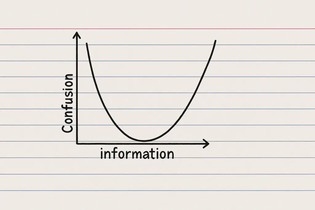
Finding the Sweet Spot in a World of Information Overload Look at the graph above. At first glance, it appears deceptively simple: a U-shaped curve showing the relationship between information and confusion. Yet this elegant visualization captures one of the most significant challenges we face in the modern world: finding the optimal balance between too little and too much information. This phenomenon explains why both inadequate information and information overload lead to increased confusion, while...
The Information-Confusion Curve